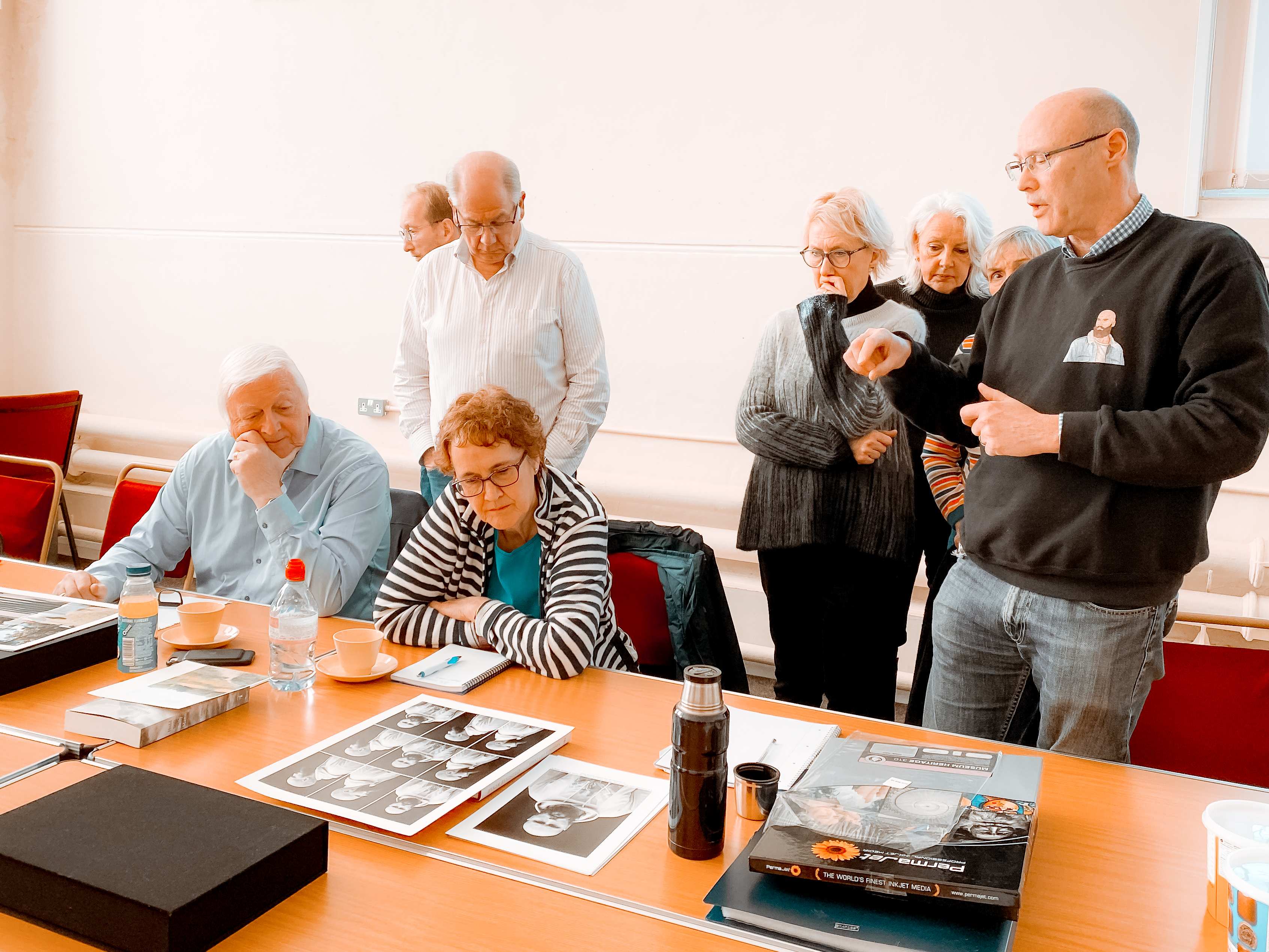
Assessment results

Final post here before I close this blog. My provisional assessment result arrived yesterday and I was delighted to get 73%. I had been worrying that my essay would let me down, it not being a critical review in the traditional sense. A link to the marksheet is here:

On the plus side they were pleased with my creativity and experimentation and my contextualisation and the engagement with various peer groups. They were specifically complimentary about the contextualisation, which was very good news.

Areas for improvement and also research going forward that they suggest include focusing a bit more on one specific type of experiment (I think) rather than the very broad approach I have used so far. They mentioned the lack of image references, which was fair comment as I only fully referenced the assignment and specifically mentioned posts. The thought of doing them all retrospectively made me feel appalled. I’ve learned this lesson and all my references in Landscape are fully referenced as I go along.

Overall, I agree with their pointers for the future and am more than happy with the result. Onwards to the second half of the degree. Let’s hope it takes a little less than 6 years. Anyone who wishes to continue following my work can find my new blog on Landscape at https://hollyocalpe.wordpress.com/


A Thames Valley workshop on printing, with some additional thoughts on art versus craftŵ

IMG_1035v2

Fig.1 Thames Valley group, January meeting. (2020 )

For this workshop, John Umney, an ex OCA student and long term print enthusiast came to give us some help with printing issues. However, the discussion also ranged far and wide on other subjects, some of which will also be covered in this post. The main points about the print process itself are listed in bullet point format below.

Basic print techniques

  •  Understand why you like the aesthetic that you do.
  • Have a basic printer/paper mix that is reliable. You can work outwards from that, but it’s handy to have a go to combination that you know works well.
  • Have a defined print process that stays the same every time.
  •  You should able to straightforwardly reproduce any of your prints
  • Good idea to record print settings for each print, in case you want to clean the print nozzles regularly, ideally every week.
  • Reproduce it later.
  • Use Photoshop for centering on paper. It’s better than Lightroom.
  • Calibrate your screen regularly, ideally before making every print. Remember to put the recalibrated profile into the print directions. (Something I had not been doing previously.
  • Matt paper tends to under-represent blacks.
  • Ideally, have a dedicated screen for print-work, with masking around it to keep out the light.
  •  If you are having problems with printing on thicker paper, clean the print rollers.

More advanced stuff

  • Think about your intent. What do you want to say with the print? The size of the margins affects how the whole print is viewed. If they are too large, the margins become more important than the image.
  •  The exact colour of paper is important to the final look. B&W images look best on ivory paper, not white. The aesthetic of a print can change significantly depending on the paper that is used.
  •  After moving some prints around the room, it is very clear that lighting hugely affects how we see a print. Lighting is something that cannot be controlled in the same way as other elements of the print, even in dark gallery spaces, as their lighting tends to be standard, rather than altered for each exhibition. Sunlight and different times of day can also alter the look enormously. There is not much you can do about this.

Finally, we had a discussion on the difference between art and craft, after John said that some of his work was art and other pieces were craft. He felt that craft involved the technical understanding and facility with which one approaches the work, while art is about narrative, contextualisation and intent/meaning. This is something I need to think through further at a later date, as I am not sure about whether I agree. With craft being traditionally more aligned with women’s work and art with man’s work, are some women’s creations being labelled as craft without understanding the background and thoughts that have gone into those creations?

References

Fig.1 Woodward, H. (2020) Thames Valley Group, January meeting. [photograph] In possession of: the author.

John Baldessari and a marker for Carol Rhodes

Strangely, both John Baldessari and Carol Rhodes both died very recently, so there has been an unusual amount written about their work and legacy to draw upon. This is a tidying up piece left over from Assignment 1, and I now wish I had looked at Baldessari in particular at the time.

Baldessari was a conceptual artist who had a huge influence over the Pop Art period too. Originally trained and working as a painter, he chose to burn all his work up to 1965 in a crematory fire, and announced that henceforth he would ‘not make any boring art’. His work thereafter used a variety of media, initially mostly text, but he worked with collage a lot later on. For the collage he generally used existing images and then altered them by, adding text or covering the faces, to make comments about their messages, and how the viewer reads images. He was particularly interested in  the relationship between text and image in that both of them use codes to convey their message. He also queried the concept of authorship, by commissioning a series of paintings and then showing them under his name, but with acknowledgement to the actual painter. (See also Richard Prince’s appropriated images. Prince was a protogée of Baldessari.)

There are lots of excellent videos online explaining Baldessari’s ideas, and one is added below as an example. Having recently seen Nam June Paik’s exhibition at the Tate Modern, I reckon they have much in common, as both have a playful, humorous approach, while making serious points at the same time.


Jonze, T. (2020). “John Baldessari, US conceptual artist with a sense of humour, dies aged 88.” In: The Guardian. At : https://www.theguardian.com/artanddesign/2020/jan/06/john-baldessari(Accessed on 24 February 2020)-us-conceptual-artist-dies-aged-88 (Accessed on 24 February 2020)

The Art Story (2020) John Baldessari. At : https://www.theartstory.org/artist/baldessari-john/ Accessed on 24 February 2020)

Carol Rhodes

Rhodes was a Scottish landscape painter with a very specific and unique style. Having done some basic research and watched the video below, I’ve decided to move this part of the post onto my next module – Landscape, as it has more specific relevance to that.

Working on prints for assignment 5

I have previously said that I needed to do some more work on the images for assignment 5, as I was not happy with their quality. So yesterday, along with Kate, I went along to our local darkroom/studio guru’s place to see if my images could be improved. Howard, who runs the place, is a long term photographer and analogue printer, who runs a darkroom and studio in Devizes, and he has been very helpful to both Kate and I over the last couple of years.

We spent the day taking photos of my A5 pieces in a little setup he had arranged with a 45 degree angled light to bring out the shadows, lumps and bumps on the albums and old photographs.I had hoped that the results could be more or less used as they came out of camera, but sadly this is not the case, and this whole exercise is proving to be much more of a technical challenge than I had anticipated. The objects themselves are not the problem – it is getting the background a uniform white that is causing the difficulty.

For my previous iteration of this series, I had made the images in natural light and then Selected and Masked the relevant bits in Photoshop, before adding a background Fill Layer of 100% white. The Selection process was not straightforward, as I wanted to keep the shadows made by the objects, and several of them contained elements of white which I had to manually remove afterwards. With the last lot, I had also shot the images on as dull a day as possible to minimise any light gradient and to cope with the relative shininess of some of the objects. I do not recall with them that light flare was much of an issue.

This time, the results also have a number of issues about which I am unhappy, but they are not the same ones as before. Firstly, with the lighting coming from the upper left quadrant, even with a reflector on the other side, there is a considerable drop-off in light across the images. Next, they all have a blue tinge and are underexposed, despite having tried various different white balances. Even having bumped up the exposure and done spot checks on white balance, they are printing with a definite blue tinge. Thirdly, and this is entirely my fault, there are a lot of spots on the images. (reminder to self – make sure you clean the lens before starting to shoot). They can be removed, but are an annoying extra which I had not anticipated. Another problem is the light flare on the shinier covers. We tried a variety of depths of diffusion, but it remains even with several layers in place, albeit not as bad as before.

Finally, having done a set of first test prints on matt A4 paper, the results are terribly flat, and show almost none of the texture I was looking for. I suspect this is possibly a result of too much contrast and wll need to have another go at editing them. I must also write up my notes from the Thames Valley Group’s workshop on printing, which may give some other solutions. And in case anyone is wondering, yes, I did calibrate my screen right before making these prints.


A6 tutor feedback

The tutor feedback for A6 and the rewritten A5 is contained below. It was a brief final feedback post to complete the module, and there was relatively little to take on board from it.

holly woodward_assn_6__report_D_i_Cholly woodward_assn_6__report_D_i_C

The main points made were:

As requested, this is a written report and bullet points the necessary tasks in pulling together a final DiC submission. Congratulations in completing DiC, Holly. You’ve clearly really engaged with the materials and you have produced some very interesting work on this course.

Looking through your completed work Holly, I think you’ve learnt a huge amount during the course of DiC. Your reworked assignment 5 is testament to your willingness to really push yourself to achieve better results. Your final assignment 5 succinctly expresses your interesting ideas and is something I think to really be proud of. You are to be commended on your engagement with your cohort and it is clear that the DiC hangout has been very useful to you in working through ideas in your work.

I will admit to being a bit amazed that Wendy was so complimentary about my final A5 submission, which is totally different from all the others, and very stark in comparison. She mentions a number of tweaks which I need to do to prepare for submission, the most immediate of which is to rephotograph the A5 images in a controlled environment, to get the effect I am looking for, but which I was unable to achieve at home. I am going to a darkroom studio tomorrow to do this work, and then it will be a case of deciding whether to print them myself or to get them done professionally.

Another visit to Messums at Tisbury

I took the opportunity recently to match a Christmas lunch with another visit to Messums Gallery, with the specific aim of seeing the Bruce Munro exhibit. It is always fun to visit modern art exhibitions with people who are not used to seeing this sort of thing, and we had an excellent time.

I had originally hoped to see Bruce Munro’s work at Alice Springs when I was there a couple of years ago, but there was not enough time, and I was delighted when I found out that he was showing at Messums. It turns out that Wiltshire is one of his home areas and often features in his work. Some of the exhibition was only on show after dark, but there was enough to keep us interested inside the buildings.

The main event was the installation in the large barn area. Munro had collected literally thousands of redundant CDs from all over the world, and placed them on a massive grid. This then had a light show with sound which was played over, producing an ever-changing view which referenced everything from the sea to a field of poppies. We could have sat in there for hours just watching how the light changed on the CDs and the resulting reflections on the walls.

Another Munro series, on a much smaller scale, was also on show in the barn. I must admit to having been a bit miffed  (LOL) to see that he had taken my experiments with colour in different locations and produced a series of works using circles, which rang a lot of personal bells. When I was doing my own work in this area I had not come across Munro’s pieces and so I can say with a clear conscience that mine was not plagiaristic.


While we were there, we also took in Dante Marioni’s fabulous glasswork. This man is a genius, and the pieces were absolutely stunning, both as objects and the detail in each one. A small selection of the work is shown below, and I love it for its intricacy, bold simplicity and wonderful colours. I would dearly like to own one of them, but they are sadly well outside my price range.

Both of these exhibitions include concepts to do with light reflections and mixing translucency with opacitywithin a work, which I want to explore further.

A day at the Tate Modern

A few weeks ago, I made a trip to London to see some exhibitions at the Tate Modern. There was so much to see that we spent the whole day there, and took in both the Nam June Paik and the Dora Maar exhibits, and also a number of individual works which were on show in the Tanks.

I wasn’t sure what to expect from the Nam June Paik and went in with an open mind. He was South Korean and had an eclectic range of interests, from how technology and art can work together, to Zen Buddhism to music and sculpture and there were a huge number of pieces in the exhibit. The most striking thing about it all was its exuberant creativity. It appeared that he could make art out of pretty much anything, although he had a soft spot for cathode ray TVs, and literally dozens of them were used, both to show images and as objects in their own right.

The work was highly conceptual and I wonder how much of it the general public understood. Certainly, even with a bit of art theory under my belt, there was a lot that probably went straight over my head. It was inspirational and we left feeling that anything goes, as long as you understand why you are doing it.

On to the Dora Maar, which was much easier to understand. The exhibit went through her early surrealist photography, which I very much enjoyed, and then looked at her work while she was pals with Picasso. This part clearly showed his influence, and sometimes it was hard to discern whether a work had been made by Picasso or Maar. When the 2WW broke out, she altered direction and began to make very abstract landscape paintings, which were rather beautiful, and thereafter her focus was more on abstract mark making. She was clearly a very talented woman.

We saw a number of individual works on the theme of Impermanence in The Tanks, but the one that appealed to me most was Ian Breakwell’s film The Other Side. Occupying a whole tank on its own, a huge screen showed ballroom dancers moving backwards and forwards on a balcony overlooking the sea, as the sun gradually set. It was accompanied by Schubert’s Nocturne in E Flat Major. The mood was contemplative and dreamy and very mesmerising. Abrupty, after 15 minutes, the screen went dead and there was the sound of breaking glass, and the roar of the waves and seagull cries could be heard. Again, the screen went dark and the dance began again. Breakwell made the work as a response to the endless impermanence and then restarting of life, and it was a wonderful piece of conceptual work. Well worth visiting if one is going to the Tate anyway.


Assignment 6 – Pre-assessment

Introduction

I started this module with high hopes that I was going to enjoy it and get a great deal out of it, but in reality, Digital Image & Culture has been as tricky as all my previous ones. Early on, I got very side-tracked by playing with silhouettes and cut-outs, which was really a continuation of work that I had undertaken for Identity & Place, assignment 5. However, this did lead me down a path which is becoming very much a feature of my research and work, i.e. active researching through iterative making and understanding of the processes. I had not realised that is was an acknowledged methodology until I attended workshops by Michele Whiting and Matt White, which gave me confidence that what I am doing is an acceptable way of research.

Assignment 1

I believe that this assignment only appeared after nearly a full year had gone by. It was originally submitted to my tutor as a series of individual photographs held in a small box, but subsequently became a wall hung lightbox, which was exhibited at the Thames Valley Group’s Time exhibition in Woking in early 2019 . There are still many ideas that I would like to explore using cut-outs and externally/back lit images, and the next step for this is to begin using my own images instead of ‘found’ ones. In particular, I would like to look at the concept of layered dioramas and deconstruction/reconstruction with reference to the work of Alma Haser, Abigail Reynolds and Joe Rudko. (As an aside, this is the only assignment currently hanging on the wall at home and is one I feel proud of producing.)

My tutor’s specific suggestions for the assignment were to consider sizing them up in number with the aim of presenting them en masse, and to rephotograph them as a completion stage of the work. That being the case I have decided to submit them as a group of rephotographed A5 images, which can be moved around within a grid framework. This removes the blank white (lit) spaces from the work and the three-dimensional element but is more practical than sending a heavy light table through the post.

Themes – family history; memory and specifically fading memory; family album; found photographs; gaps in information; rephotography.

Assignment 2

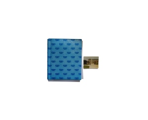
This assignment piece was an exploration of the meaning of a digital image through its non-material nature. My tutor was happy with the assignment, and gave me some photographers to look at, which I included in the reflective feedback. The presentation (a ring bound flip book) works well and reflects the study I was undertaking, i.e. layering within the materiality of the image.

Themes – materiality; exploration of process; multi-faceted nature of perception; layering; deconstruction and reconstruction.

Assignment 3

This was the critical review assignment, and I really enjoyed putting it together, as it allowed an exploration of fake news and news manipulation, something I am separately interested in. The academic research has been unexpectedly enjoyable and combined with the Photography Reading Group’s discussions, has significantly expanded my understanding of the philosophy behind photography. I intend to continue with this area of research in the next module. My tutor’s comments related specifically to reducing the number of references and to adding some image examples to the work, which I will do for assessment.

Themes – current news; fakery in photography; questioning of photography’s historical relationship with the truth.

Assignment 4

Again, this took a long time and much experimentation to reach something that I felt I could submit to my tutor. The concept followed on from the theoretical work undertaken in assignment 3 on our understanding of truth and reality, both as individuals and as society. It began with mirror cubes and ended when I bought a new computer and was able to physically take apart the old one and photograph its components; what is behind the ‘black box’. My tutor’s comments were that I needed to settle on one specific aspect of the work, and she suggested I concentrate on how images and memories interrelate with their physical storage in the digital era. This assignment is not required to be finished work, and thus I did not take it any further at this stage. I need to consider how to present my ideas and am currently thinking about whether to use my scrapbook as the physical part of the assignment, since that documents the iterative process best.

Themes – layers; transparency; digital life and its philosophical underpinning.

Assignment 5

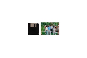
My first iteration of this involved photographing the internal components of a deconstructed computer, alongside photographs that had been held in the hard drive. My tutor felt that it still lacked clarity, and that I should concentrate specifically on matching single photographs with their containers. Initially I was resistant to this, but once I began to test it out, I realised that it did tell the story of the loss of material and indexical information that comes with digital image storage with more clarity and simplicity than the previous work. Thus I feel it is now an improved series, albeit one that does not contain a single images from any of the work leading up to it.

Themes – materiality, indexicality, signifiers and signified, memory.


Learning log

All of my tutors have been complimentary about my learning logs and the way they are laid out. There are minor issues which I would like to sort out, such as putting on a search button and I will put each assignment under a separate heading for assessment, but otherwise there is no additional work necessary.

A feature of my learning for this module has been my significantly increased use of a scrapbook to record ideas and interim images, which I am submitting alongside the assignment work, as it is an important part of the overall journey. (see Assignment 4 especially) Also improving is my more organised approach to recording academic research in a separate notebook, which is indexed for future reference. I have enjoyed the research aspects of this module and have delved into philosophy particularly in a way which I found unexpectedly rewarding and which clearly influenced my approach to assignments. These two notebooks are also backed up by a separate hard copy file of practical Photoshop and research techniques, again fully indexed. (Not being sent).

Outstanding work to be done

  • A1 – print for presentation
  • A2 – none
  • A3 – final corrections and addition of explanatory photos
  • A4 – decide on presentation – printed images or scrapbook?
  • A5 – take my tutor’s feedback comments on board and decide on print size
  • Other – complete notation of scrapbook ideas

I also need to complete some half-finished blog posts, specifically those on:

  •  John Baldessari and Carol Rhodes
  •  the concepts behind research through practise

Ideas for future work

• Continue experimenting with gaps, translucency and layering
• Experiment with adding light to images in ways with specific meaning
• Continue looking at introducing silhouettes into work, specifically in physically layered pieces
• Continue philosophical background reading and integrate ideas into my work
• Bring handmade books in as methods of presentation, which can add further levels of meaning.


Assignment 5 – rewrite

Following feedback from my tutor, I have decided to rewrite the assignment, taking on board the suggestion that I concentrate on producing images of photographs with the storage devices they occupy. Therefore the new version of A5 is attached below, with a revised artist’s statement which reflects the altered frame of reference.

Revised artist’s statement

We pick up a photograph and are instantly transported back to when it was made. It induces a memory which surrounds the act of making the picture; a memory which is not significant in its own right, being generally banal and unimportant, but one that is part of our personal history. The same memory pops up every time we look at that image; it is etched in our minds – an association that we cannot unmake. (Rancière, 2009)

But what of those memories longer term? As outlined in assignment 1, they tend to fade with the passing of the people who made the photographs and we are left with the material traces. Until recently, these have generally consisted of negatives, printed images and albums, but they themselves hold symbolic meaning as both anchors to our family past and as signifiers which hold clues about the people and the lives they led. These signs instantly anchor the images in the time in which they were made.

However, current and future generations will preserve their memories on the computer and the Cloud in online libraries such as Facebook, Instagram and Twitter, which can be accessed anytime, anywhere, so long as the owner can recall where they were stored, but which cannot be physically handled and passed down the generations. In effect, the Cloud is has become the custodian of our images. They are more accessible as anyone can look at them online, unlike in the past where the keeper of the family archive was the only person who could access the images without having to ask. But there is a price to pay.

In this series, photographs from my family archive for each decade from the 1920s are placed alongside the objects which contain them and rephotographed. The viewer is invited to consider what we are losing by the transfer of our photographs from paper to digital media. The cherished and much thumbed family album, with its marks, missing photographs and written notes has been replaced by an impersonal screen and I question whether, in this loss of materiality and its associated indexicality, an important element of our collective history is disappearing too.

Death of the photo album

Notes for specific consideration in tutor feedback

  1. My intention is to rephotograph the images in a studio setting to get completely clean copies. The current versions have been subject to my amateur Photoshop efforts and I know there are some bits that could look better.
  2. Print sizing – the intention is to print them at A3 on matt paper at life size, if possible. Thus the borders will vary depending on the size of the objects.
  3. 3. Just a thought – might it be better to show the insides of the albums, rather than the covers?
  4. Although the images are given decadal dates, I have left these off the prints themselves, having explained the sequence in the artist’s statement.
  5.  I’m still pondering on the title.

Assignment 5 – tutor feedback

I had my video tutorial with Wendy last Friday, but with all the pre-Christmas activities, hadn’t got around to writing it up until now. Below is a link to the written feedback. As with previous assignments, I will respond to specific comments only.

holly woodward_assn_5__report_D_i_C

Rather than reverting to a pre-photographic age, It may be more useful to think more in terms of our move a hyper visual culture where we are constantly surrounded by photographic images. We are actually taking, viewing and reviewing family photography for example far more often than ever before, and mobile computing has meant that effectively we constantly carry our family history with us, 24/7 in fact.

Wendy did not accept my premise about the demise of the family album and argues that we have more, rather than less access to family images in the digital era. That wasn’t really what I had meant though, so I need to consider whether to go down her suggested route or to try to make my current concept more easily understandable. What I really wanted to get across is that the performative and ceremonial aspects of getting out and going over the family album are dying out. Their current method of storage does not allow for this, and images tend to be glanced at quickly, instead of being pored over. In a way, I am mourning the disappearing pleasure of going through my mother and grandmother’s albums, looking at their clothes and the background scenery, and looking for family resemblences. She thought the way to go was to consider how redundant media is associated with certain types of image, providing ‘a timelock to a particular period‘. She mentioned obsolescent technologies, such as old computer drives and storage methods. I will have to think about this over Christmas with the aim of producing a re-write in early January.

I think the simplest approach often works best here – as in the second image in your series, where one image is simply presented next to its associated hard drive. Your first image works well too. That way of bringing gives us all of the information we need. For your final submission, I’d produce a series of images which are produced in a similar way visually. Do you want to add titles (dates etc?) That might be interesting in regards to your theme?

I think what Wendy is saying here is that simplicity is better than overload and to limit the amount of information on each image. I too like no 3 (my numbering including the grids at present) and think it is the strongest of the group. I take the point about producing 8-12. There needs to be more of them.

I’m not sure that you need the grid of images? Presumably this is a highly edited set of images anyway as the original HD must contain tens of thousands of images?

I’d been wondering about this myself, and am pleased that Wendy gave me a definite steer on this. She talked about ways of producing a similar effect by using a less formal arrangement, perhaps scattering layers of images on top of each other, to  express the ideas of quantity and the layering that has been a feature throughout this module.

Let’s discuss paper stock, scale and methods of presentation at our 1-2-1. 

We did so, and Wendy suggested that a quality matt pape such as Hahnemuhle at A3 size would best suit this series. (Note to self – my printer, although excellent, struggles with thicker papers, so I either need to sort out the problem or get the images printed professionally.)

Using the photographic techniques normally reserved for fashion and advertising. Photographic duo Christto & Andrew use photography to produce strange still lives where computer parts and other technologies are brought together with natural forms: https://www.rencontres-arles.com/en/expositions/view/248/christto-andrew

Wendy suggested I look at the above photography duo for ideas on presentation, but also Valerie Belín, and in particular her typological series, and I will write a separate post about these.

Apart from the assignment work, we also discussed timings for my final assignment. I need to have finished A6 by the end of January, and so we have agreed that I will submit a re-write of A5, plus A6 for written feedback only by 17th January. A6 will include an appraisal of the module and how I related to the different assignments, plus some thoughts on what the experience has taught me about how I approach my own work and in particular ideas on visual research methods and learning through making.