Tag Archives: printing

A Thames Valley workshop on printing, with some additional thoughts on art versus craftŵ

IMG_1035v2

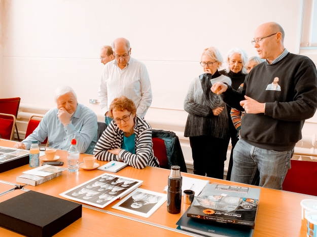
Fig.1 Thames Valley group, January meeting. (2020 )

For this workshop, John Umney, an ex OCA student and long term print enthusiast came to give us some help with printing issues. However, the discussion also ranged far and wide on other subjects, some of which will also be covered in this post. The main points about the print process itself are listed in bullet point format below.

Basic print techniques

  •  Understand why you like the aesthetic that you do.
  • Have a basic printer/paper mix that is reliable. You can work outwards from that, but it’s handy to have a go to combination that you know works well.
  • Have a defined print process that stays the same every time.
  •  You should able to straightforwardly reproduce any of your prints
  • Good idea to record print settings for each print, in case you want to clean the print nozzles regularly, ideally every week.
  • Reproduce it later.
  • Use Photoshop for centering on paper. It’s better than Lightroom.
  • Calibrate your screen regularly, ideally before making every print. Remember to put the recalibrated profile into the print directions. (Something I had not been doing previously.
  • Matt paper tends to under-represent blacks.
  • Ideally, have a dedicated screen for print-work, with masking around it to keep out the light.
  •  If you are having problems with printing on thicker paper, clean the print rollers.

More advanced stuff

  • Think about your intent. What do you want to say with the print? The size of the margins affects how the whole print is viewed. If they are too large, the margins become more important than the image.
  •  The exact colour of paper is important to the final look. B&W images look best on ivory paper, not white. The aesthetic of a print can change significantly depending on the paper that is used.
  •  After moving some prints around the room, it is very clear that lighting hugely affects how we see a print. Lighting is something that cannot be controlled in the same way as other elements of the print, even in dark gallery spaces, as their lighting tends to be standard, rather than altered for each exhibition. Sunlight and different times of day can also alter the look enormously. There is not much you can do about this.

Finally, we had a discussion on the difference between art and craft, after John said that some of his work was art and other pieces were craft. He felt that craft involved the technical understanding and facility with which one approaches the work, while art is about narrative, contextualisation and intent/meaning. This is something I need to think through further at a later date, as I am not sure about whether I agree. With craft being traditionally more aligned with women’s work and art with man’s work, are some women’s creations being labelled as craft without understanding the background and thoughts that have gone into those creations?

References

Fig.1 Woodward, H. (2020) Thames Valley Group, January meeting. [photograph] In possession of: the author.

Working on prints for assignment 5

I have previously said that I needed to do some more work on the images for assignment 5, as I was not happy with their quality. So yesterday, along with Kate, I went along to our local darkroom/studio guru’s place to see if my images could be improved. Howard, who runs the place, is a long term photographer and analogue printer, who runs a darkroom and studio in Devizes, and he has been very helpful to both Kate and I over the last couple of years.

We spent the day taking photos of my A5 pieces in a little setup he had arranged with a 45 degree angled light to bring out the shadows, lumps and bumps on the albums and old photographs.I had hoped that the results could be more or less used as they came out of camera, but sadly this is not the case, and this whole exercise is proving to be much more of a technical challenge than I had anticipated. The objects themselves are not the problem – it is getting the background a uniform white that is causing the difficulty.

For my previous iteration of this series, I had made the images in natural light and then Selected and Masked the relevant bits in Photoshop, before adding a background Fill Layer of 100% white. The Selection process was not straightforward, as I wanted to keep the shadows made by the objects, and several of them contained elements of white which I had to manually remove afterwards. With the last lot, I had also shot the images on as dull a day as possible to minimise any light gradient and to cope with the relative shininess of some of the objects. I do not recall with them that light flare was much of an issue.

This time, the results also have a number of issues about which I am unhappy, but they are not the same ones as before. Firstly, with the lighting coming from the upper left quadrant, even with a reflector on the other side, there is a considerable drop-off in light across the images. Next, they all have a blue tinge and are underexposed, despite having tried various different white balances. Even having bumped up the exposure and done spot checks on white balance, they are printing with a definite blue tinge. Thirdly, and this is entirely my fault, there are a lot of spots on the images. (reminder to self – make sure you clean the lens before starting to shoot). They can be removed, but are an annoying extra which I had not anticipated. Another problem is the light flare on the shinier covers. We tried a variety of depths of diffusion, but it remains even with several layers in place, albeit not as bad as before.

Finally, having done a set of first test prints on matt A4 paper, the results are terribly flat, and show almost none of the texture I was looking for. I suspect this is possibly a result of too much contrast and wll need to have another go at editing them. I must also write up my notes from the Thames Valley Group’s workshop on printing, which may give some other solutions. And in case anyone is wondering, yes, I did calibrate my screen right before making these prints.


A6 tutor feedback

The tutor feedback for A6 and the rewritten A5 is contained below. It was a brief final feedback post to complete the module, and there was relatively little to take on board from it.

holly woodward_assn_6__report_D_i_Cholly woodward_assn_6__report_D_i_C

The main points made were:

As requested, this is a written report and bullet points the necessary tasks in pulling together a final DiC submission. Congratulations in completing DiC, Holly. You’ve clearly really engaged with the materials and you have produced some very interesting work on this course.

Looking through your completed work Holly, I think you’ve learnt a huge amount during the course of DiC. Your reworked assignment 5 is testament to your willingness to really push yourself to achieve better results. Your final assignment 5 succinctly expresses your interesting ideas and is something I think to really be proud of. You are to be commended on your engagement with your cohort and it is clear that the DiC hangout has been very useful to you in working through ideas in your work.

I will admit to being a bit amazed that Wendy was so complimentary about my final A5 submission, which is totally different from all the others, and very stark in comparison. She mentions a number of tweaks which I need to do to prepare for submission, the most immediate of which is to rephotograph the A5 images in a controlled environment, to get the effect I am looking for, but which I was unable to achieve at home. I am going to a darkroom studio tomorrow to do this work, and then it will be a case of deciding whether to print them myself or to get them done professionally.

Some thoughts subsequent to a gelli printing experiment

A couple of days ago, Kate and I got together to have a go at gelli printing. We had been inspired by some of the work we saw at the Marlborough Open Studios (to be the subject of another post) and thought we would try it. I must point out here that I have a deeply ingrained fear of trying to make ‘art’ as I was rubbish at it at school and never tried anything again after that, so the experiment was undertaken with some trepidation.

A fuller review of the day can be found on Kate’s blog here, but from my point of view mixing the acrylic paints to get new colours was interesting, and it was fun to try out different textured objects to see what would happen. The whole process is a bit hit and miss and as beginners we did not always (often) get the results we were expecting. I’m not even sure whether the pros can always guarantee results as the process seems to be inherently less than 100% reliable, However, I was interested in my reaction to this, as I felt out of my depth and unable to clearly visualise what I wanted to make.

Having said all that, once we got started, I got into making some small collages using the printed results, and bits of gauze fabric and paper and I was quite pleased with a couple of my efforts, They will go into my scrapbook for further consideration.

The main point of relating this though is to put a marker up about some of the unexpected results of the printing process. Followers of my blog will know that I love looking at the detail at the edges of badly printed images and having considered Paul Kenny’s book O Hanami, which arrived yesterday, I am pretty sure that the way I want to go with my practice is towards macro photography of detail and the creation of alternate pieces from them. I realise this sounds a bit vague, but over the summer I am going to concentrate on thinking about this and producing some work along these lines, maybe in line with my next assignment; maybe not.